ggmatplot is a quick and easy way of plotting the
columns of two matrices or data frames against each other using ggplot2.
ggmatplot is built upon ggplot2, and its
functionality is inspired by matplot.
Therefore, ggmatplot can be considered as a
ggplot version of matplot.
What does ggmatplot do?
Similar to matplot,
ggmatplot plots a vector against the columns of a matrix,
or the columns of two matrices against each other, or a vector/matrix on
its own. However, unlike matplot,
ggmatplot returns a ggplot object.
Suppose we have a covariate vector x and a matrix
z with the response y and the fitted value
fit.y as the two columns.
# vector x
x <- c(rnorm(100, sd = 2))

head(x)
#> [1]  2.72979795 -0.14424224 -2.76549313 -1.34403190 -1.64266511 -0.08304215

# matrix z
y <- x * 0.5 + rnorm(100, sd = 1)
fit.y <- fitted(lm(y ~ x))
z <- cbind(actual = y,
           fitted = fit.y)

head(z)
#>       actual      fitted
#> 1  1.0617321  1.56788904
#> 2 -0.7643612 -0.01619957
#> 3 -1.5831225 -1.46095797
#> 4  0.4770078 -0.67748926
#> 5 -0.8044123 -0.84208733
#> 6  1.0486817  0.01753216
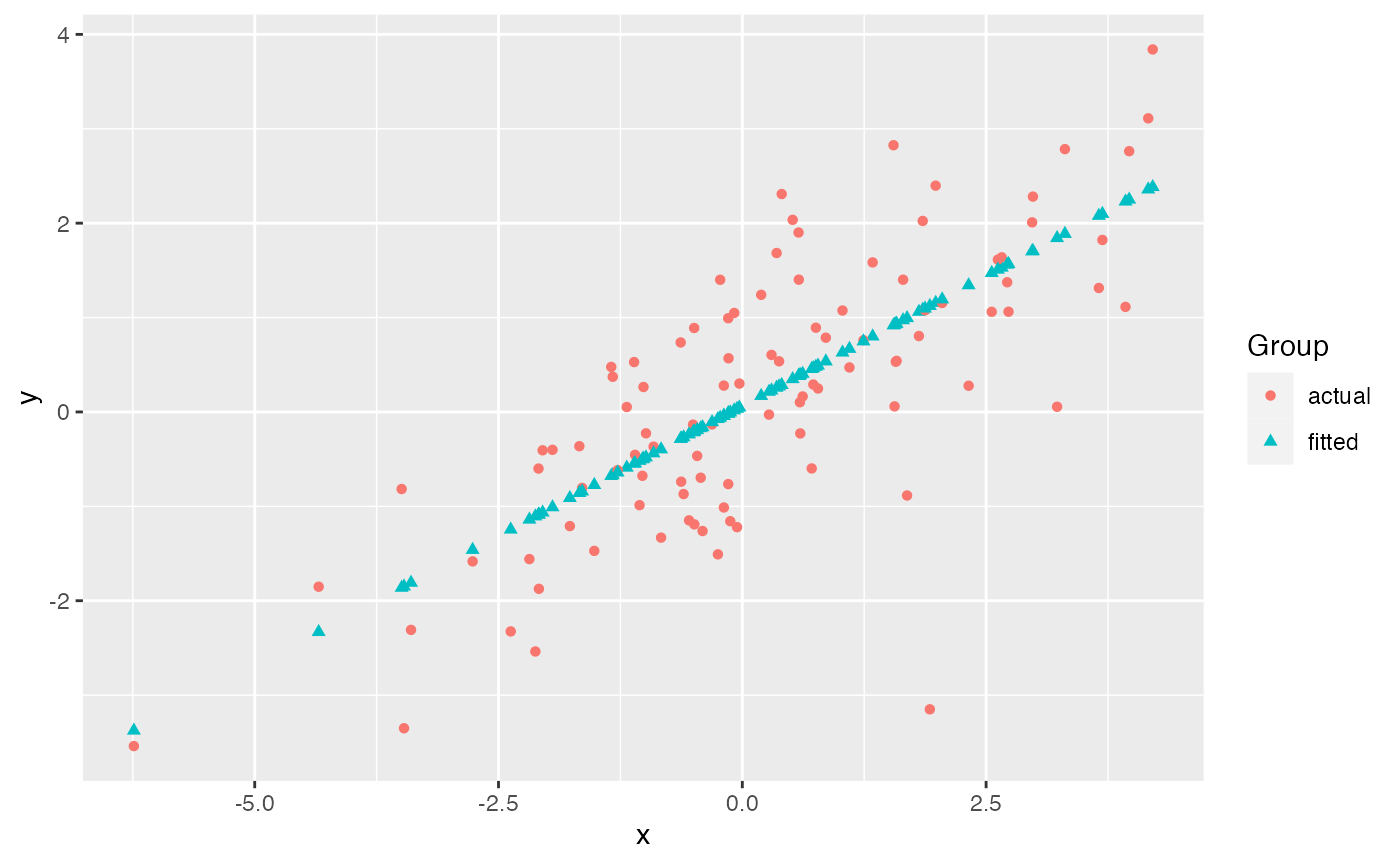
ggmatplot plots vector x against each
column of matrix z using the default
plot_type = "point". This will be represented on the
resulting plot as two groups, identified using different shapes and
colors.
The default aesthetics used to differentiate the two groups can be
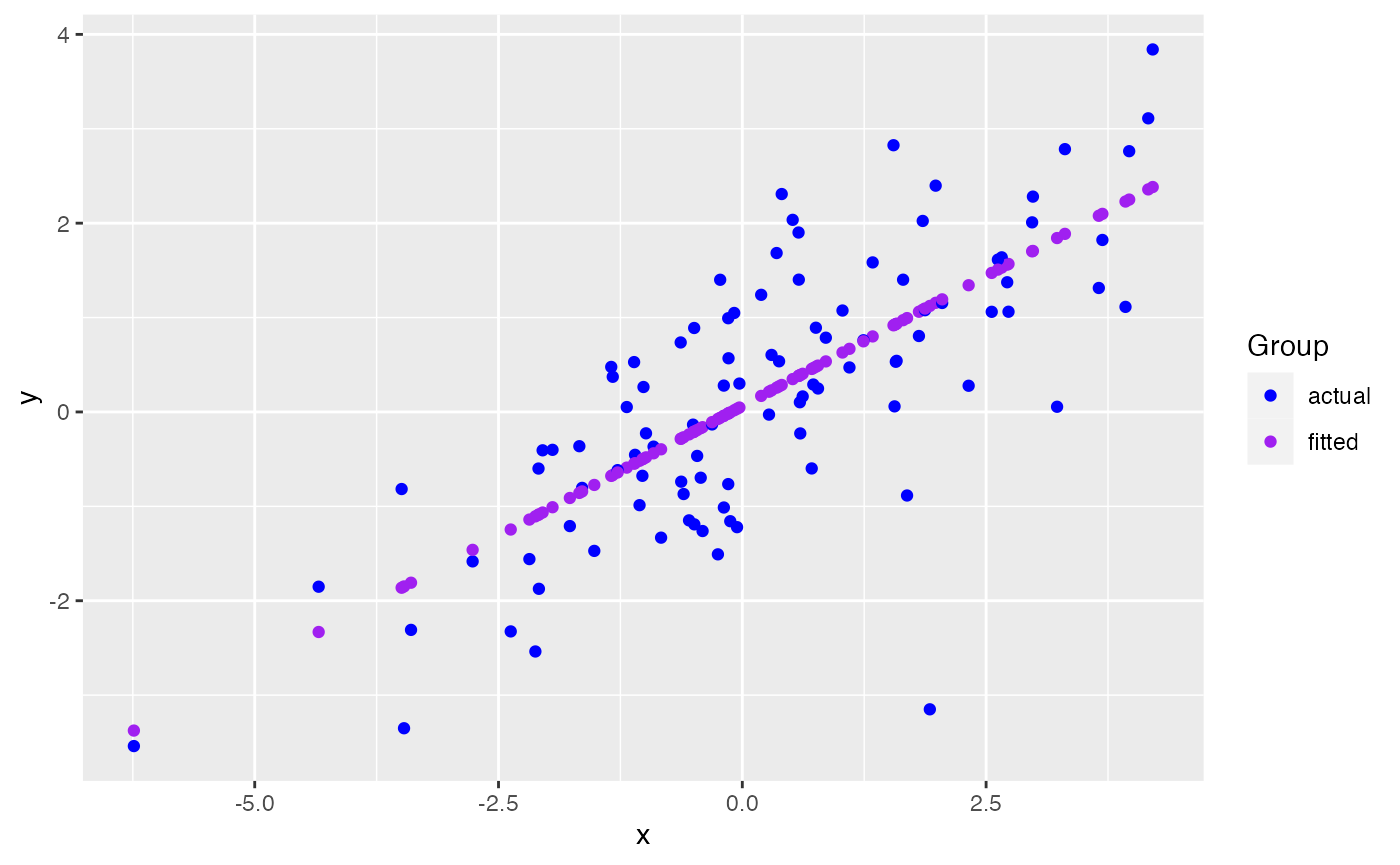
updated using ggmatplot() arguments. Since the two groups
in this example are differentiated using their shapes and colors, the
shape and color parameters can be used to
change them. If we want points in both groups to have the same shape, we
can simply set the shape parameter to a single value.
However, if we want the points in the groups to be differentiated by
color, we can pass a list of colors as the color parameter
- but we should make sure the number of colors in the list matches up
with the number of groups.
ggmatplot(x, z,
          shape = "circle", # using a single shape over both groups
          color = c("blue","purple") # assigning two colors to the two groups
          )
Since ggmatplot is built upon ggplot2 and
creates a ggplot object, ggplot add
ons such as scales, faceting specifications, coordinate systems, and
themes can be added on to plots created using ggmatplot
too.
Each plot_type allowed by the ggmatplot()
function is also built upon a ggplot2 geom (geometric
object), as listed here. Therefore,
ggmatplot() will support additional parameters specific to
each plot type. These are often aesthetics, used to set an aesthetic to
a fixed value, like size = 2 or alpha = 0.5.
However, they can also be other parameters specific to different types
of plots.
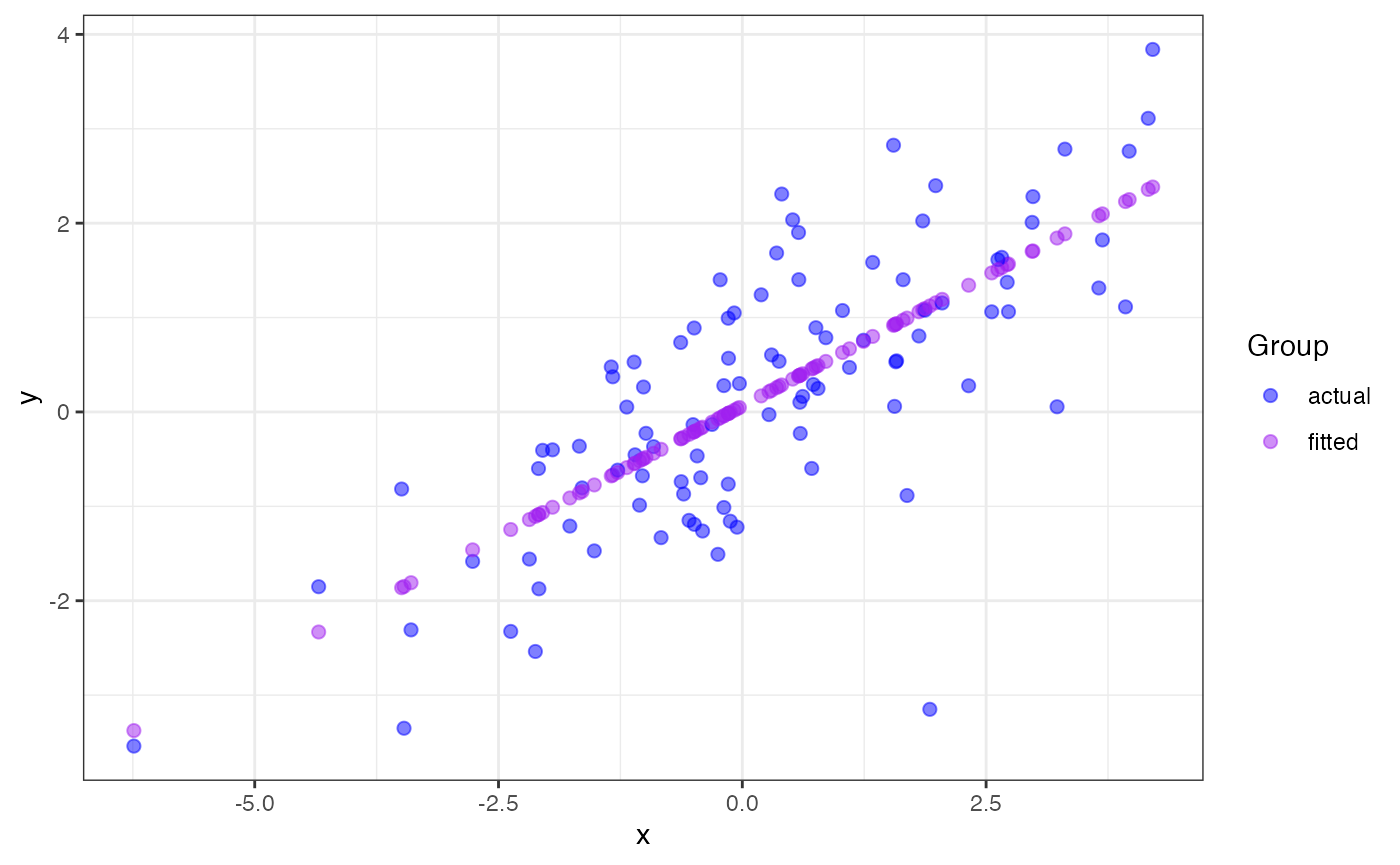
This list of examples includes
other types of plots we can create using ggmatplot.
When can we use ggmatplot over
ggplot2?
ggplot2
requires wide format data to be wrangled into long format for plotting,
which can be quite cumbersome when creating simple plots. Therefore, the
motivation for ggmatplot is to provide a solution that
allows ggplot2
to handle wide format data. Although ggmatplot doesn’t
provide the same flexibility as ggplot2, it can
be used as a workaround for having to wrangle wide format data into long
format and creating simple plots using ggplot2.
Suppose we want to use the iris dataset to plot the
distributions of its numeric variables individually.
library(tidyr)
library(dplyr)

iris_numeric <- iris %>%
  select(is.numeric)

head(iris_numeric)
#>   Sepal.Length Sepal.Width Petal.Length Petal.Width
#> 1          5.1         3.5          1.4         0.2
#> 2          4.9         3.0          1.4         0.2
#> 3          4.7         3.2          1.3         0.2
#> 4          4.6         3.1          1.5         0.2
#> 5          5.0         3.6          1.4         0.2
#> 6          5.4         3.9          1.7         0.4
If we were to plot this data using ggplot2, we’d
have to wrangle the data into long format before plotting.
iris_numeric_long <- iris_numeric %>%
  pivot_longer(cols = everything(),
               names_to = "Feature",
               values_to = "Measurement")

head(iris_numeric_long)
#> # A tibble: 6 × 2
#>   Feature      Measurement
#>   <chr>              <dbl>
#> 1 Sepal.Length         5.1
#> 2 Sepal.Width          3.5
#> 3 Petal.Length         1.4
#> 4 Petal.Width          0.2
#> 5 Sepal.Length         4.9
#> 6 Sepal.Width          3

iris_numeric_long %>%
  ggplot(aes(x = Measurement,
             color = Feature)) +
  geom_density()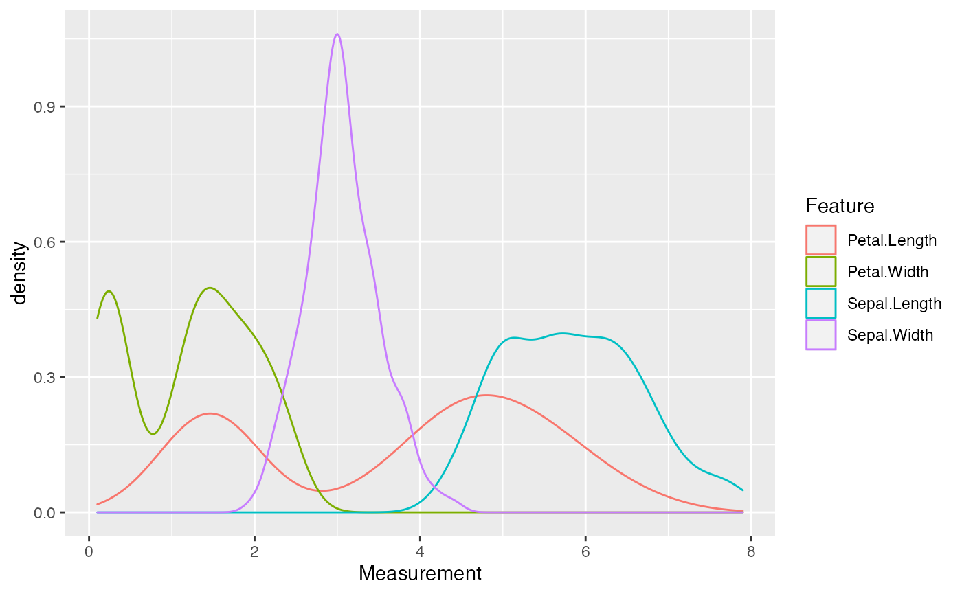
But the wide format data can be directly used with
ggmatplot to achieve the same result. Note that the order
of the categories in the legend follows the column order in the original
dataset.
ggmatplot(iris_numeric, plot_type = "density", alpha = 0)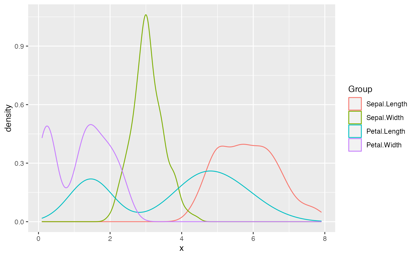
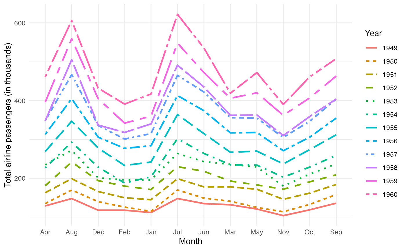
Suppose we also have the following dataset of the monthly totals of international airline passengers(in thousands) from January 1949 to December 1960.
AirPassengers <- matrix(AirPassengers,
  ncol = 12, byrow = FALSE,
  dimnames = list(month.abb, as.character(1949:1960))
)

AirPassengers
#>     1949 1950 1951 1952 1953 1954 1955 1956 1957 1958 1959 1960
#> Jan  112  115  145  171  196  204  242  284  315  340  360  417
#> Feb  118  126  150  180  196  188  233  277  301  318  342  391
#> Mar  132  141  178  193  236  235  267  317  356  362  406  419
#> Apr  129  135  163  181  235  227  269  313  348  348  396  461
#> May  121  125  172  183  229  234  270  318  355  363  420  472
#> Jun  135  149  178  218  243  264  315  374  422  435  472  535
#> Jul  148  170  199  230  264  302  364  413  465  491  548  622
#> Aug  148  170  199  242  272  293  347  405  467  505  559  606
#> Sep  136  158  184  209  237  259  312  355  404  404  463  508
#> Oct  119  133  162  191  211  229  274  306  347  359  407  461
#> Nov  104  114  146  172  180  203  237  271  305  310  362  390
#> Dec  118  140  166  194  201  229  278  306  336  337  405  432
If we want to plot the trend of the number of passengers over the
years using ggplot2, we’d have to wrangle the data into
long format. But we can use ggmatplot as a workaround.
First, we can split the data into two matrices as follows:
months: a vector containing the list of monthsnPassengers: a matrix of passenger numbers with each column
representing a year
months <- rownames(AirPassengers)
nPassengers <- AirPassengers[, 1:12]
Then we can use ggmatplot() to plot the
months matrix against each column of the
nPassengers matrix - which can be more simply understood as
grouping the plot using each column(year) of the
nPassengers matrix.
ggmatplot(
  x = months,
  y = nPassengers,
  plot_type = "line",
  size = 1,
  legend_label = c(1949:1960),
  xlab = "Month",
  ylab = "Total airline passengers (in thousands)",
  legend_title = "Year"
) +
  theme_minimal()